Interval
New work across five of the six selected tasks.
The combined interval links concept exploration to implementation. Prompts progressively tightened habitat realism, room composition, typography, dive economy, underwater atmosphere and reward presentation. One selected task had no work after its previous checkpoint, so its earlier material is not repeated.
Direction of travel
How the work evolved.
Each step connects the user’s prompt to the practical change it produced.
Direction chosen
Collections became habitat stories
Prompt: Move wildlife away from implausible sticker placement and explore a presentation that keeps each species in an appropriate environment.
Outcome: The recommended direction keeps the equipment-room poster as the entry point, then opens curated reef, shallows, shore and open-water scenes with large collection cards.
Implemented
One reef proved the habitat model
Prompt: Apply the poster and habitat changes to a complete reef, make every sticker available for testing, and avoid charging the player.
Outcome: Four native habitats were delivered with scene-appropriate wildlife placement, readable selection cards and a development-only preview path that spends no gems.
Refined
The wider interface found a warmer voice
Prompt: Use device screenshots to remove generic-feeling presentation, fix awkward navigation and improve clarity without losing the approved expedition style.
Outcome: Room guidance, gem displays, dive names, tappable cards, information contrast, completion states and collection surfaces were brought into one Barlow-led visual system.
Implemented
Restricted dives gained meaningful pressure
Prompt: Implement the planned air-limited mode, then clarify that refills should be offered only when the tank expires and should not reset medal timing.
Outcome: A 12-minute tank, two paid refill choices, partial resurfacing rewards and elapsed-time medal thresholds now create a complete risk-and-reward loop.
Direction chosen
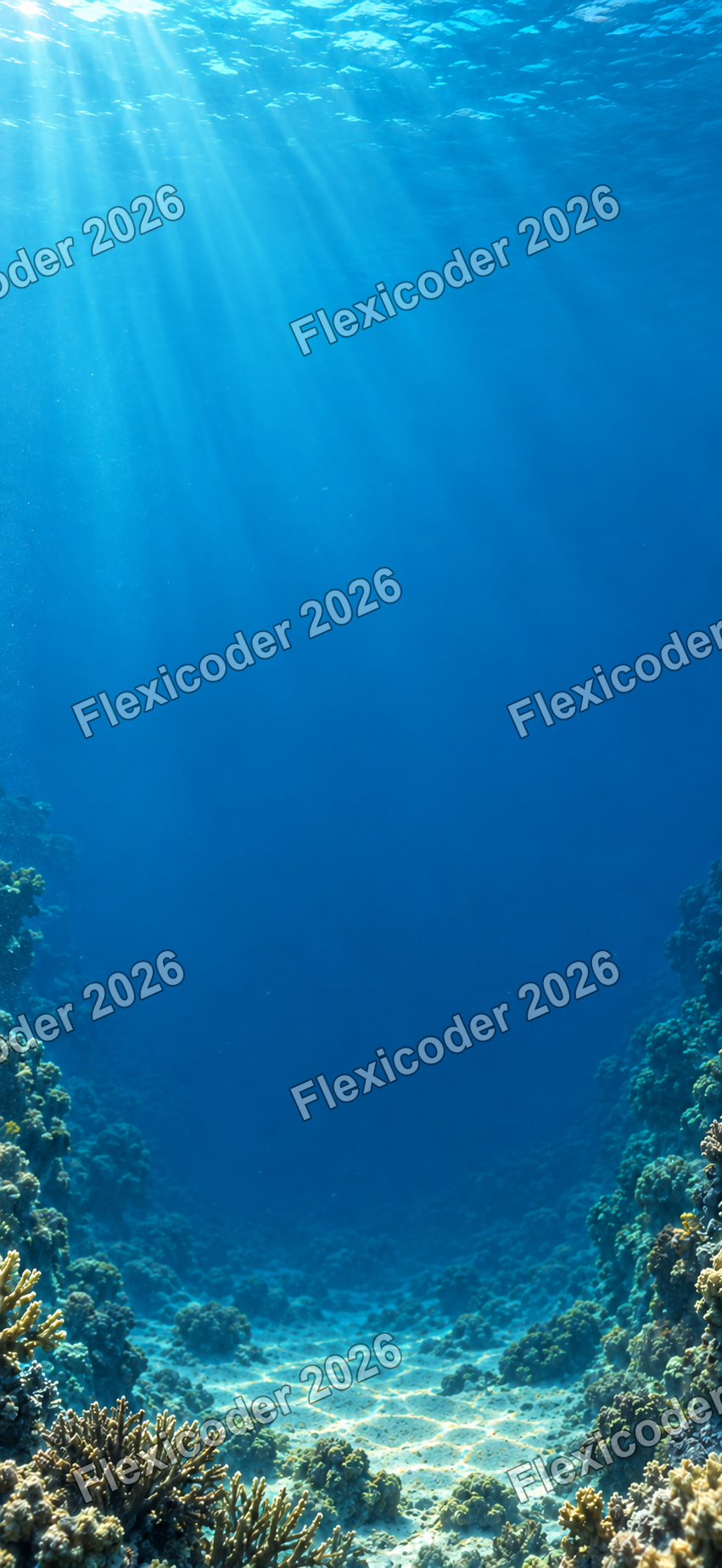
Cream gave way to open water
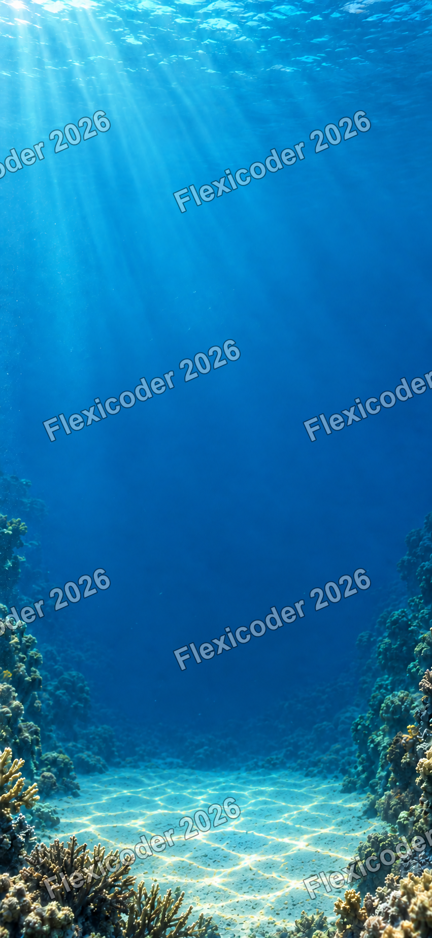
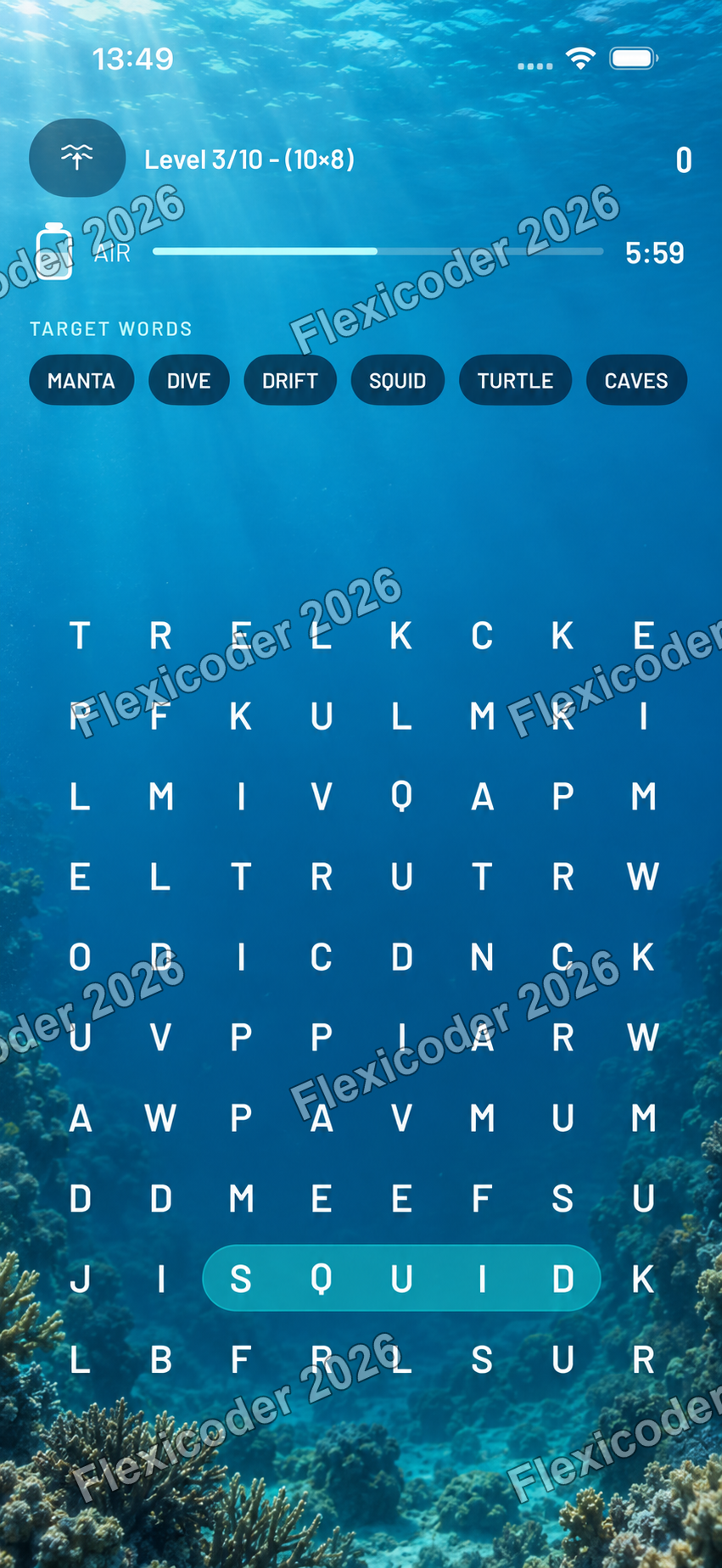
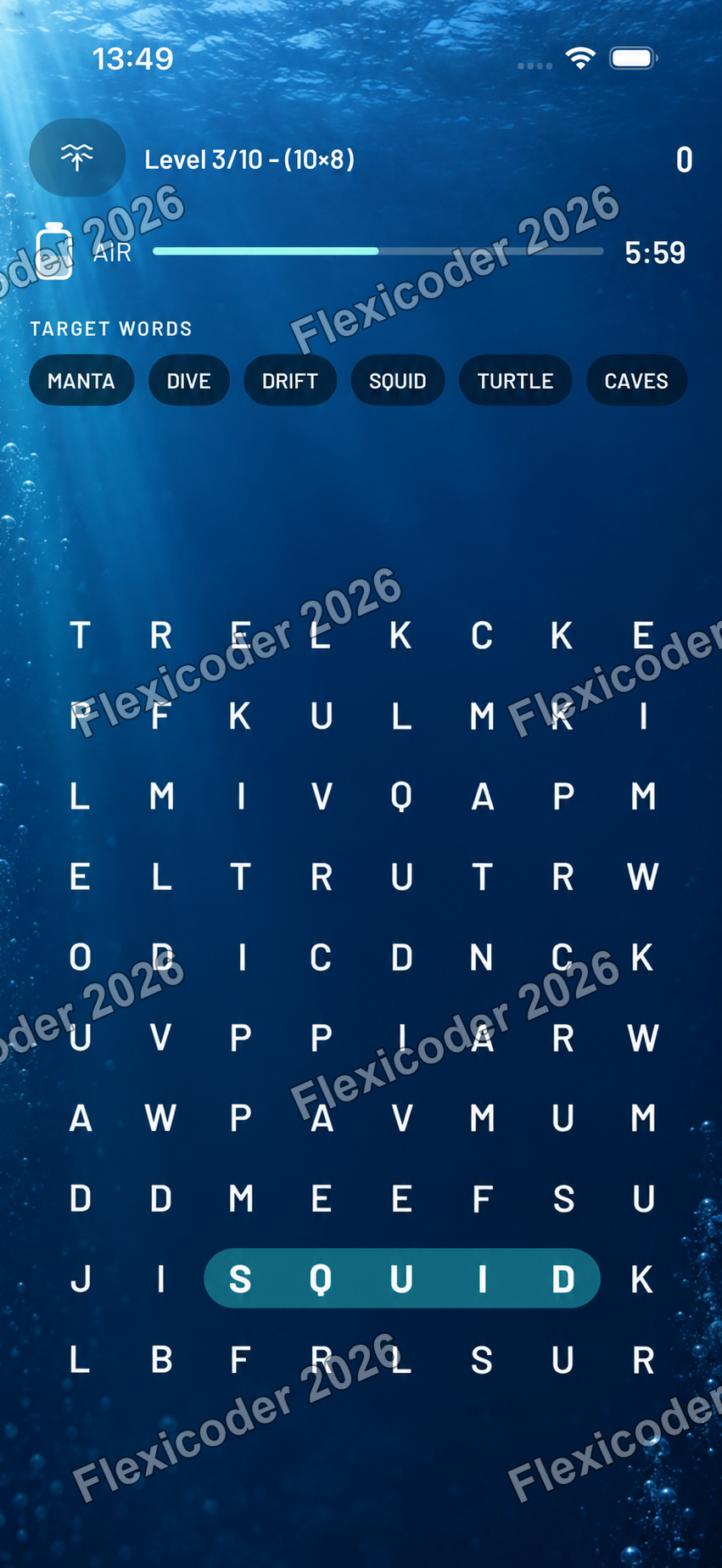
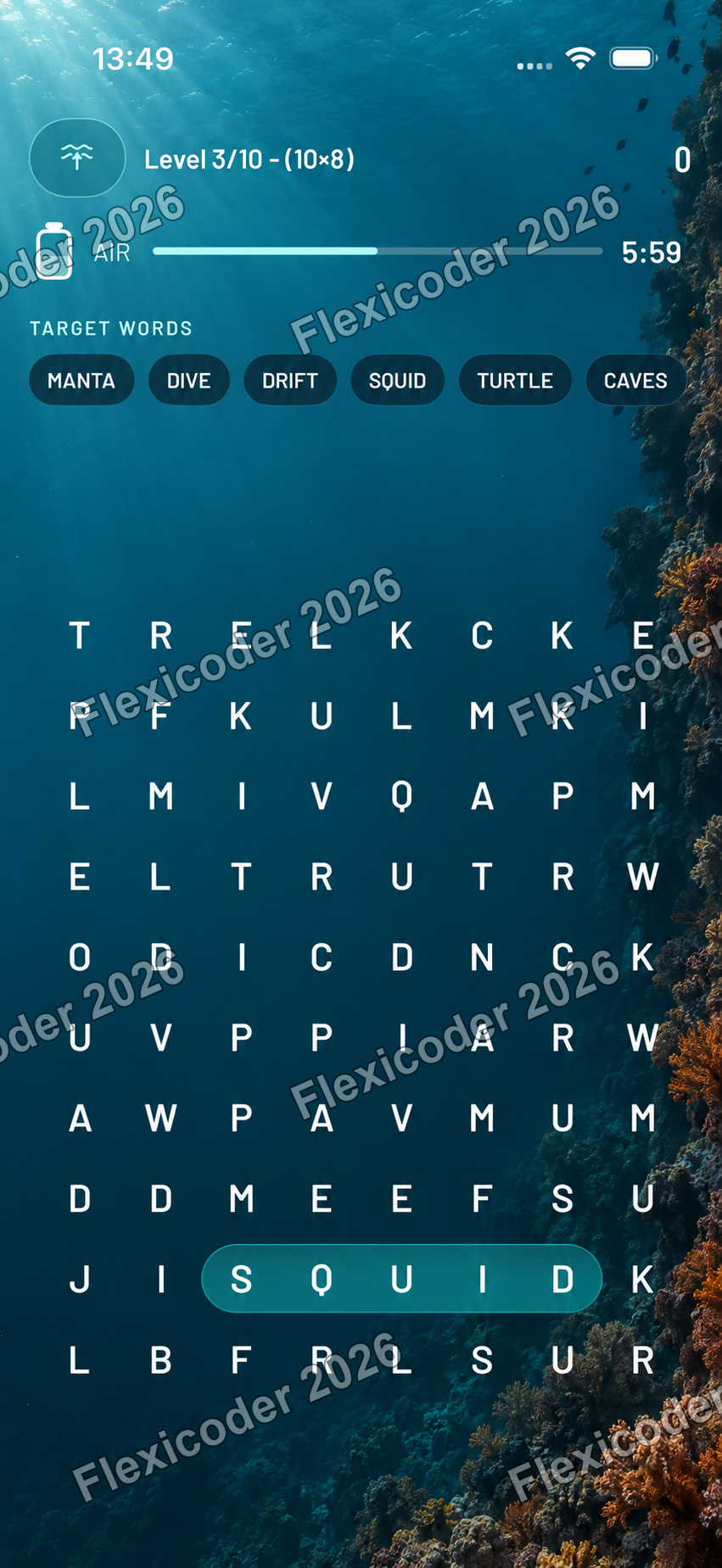
Prompt: Make the wordgrid feel like an actual dive rather than another cream screen, while preserving normal-size text and letter clarity.
Outcome: Three full-screen underwater concepts were compared. Clear reef descent was selected for its balance of atmosphere, contrast and space around the grid.
Simplified
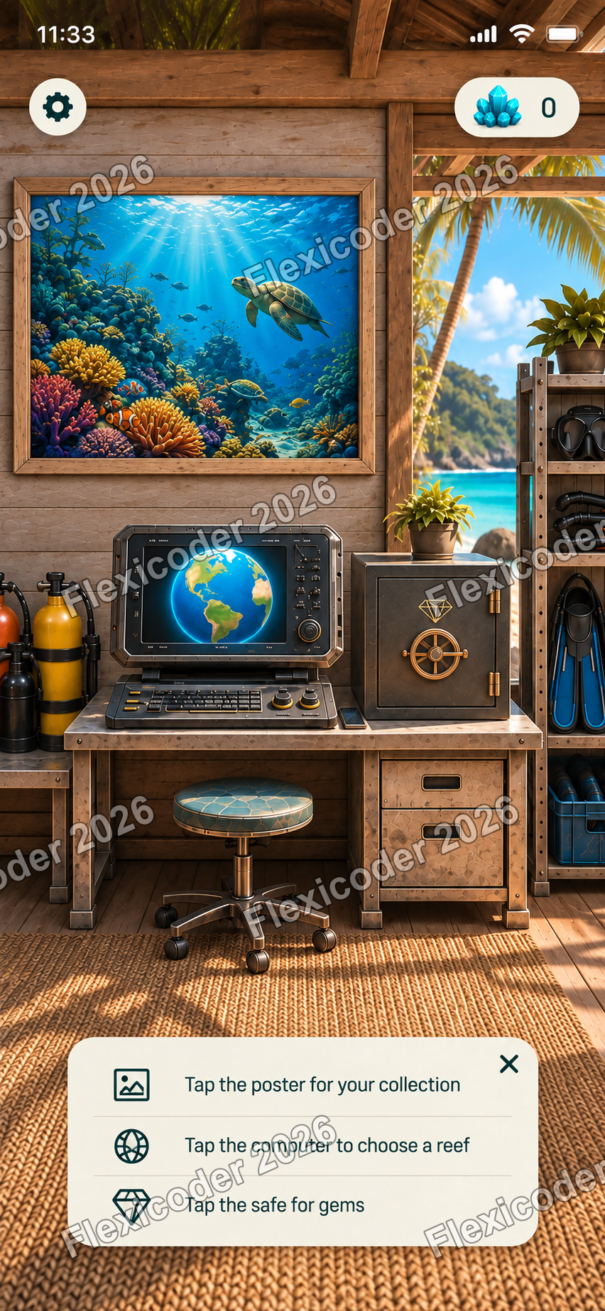
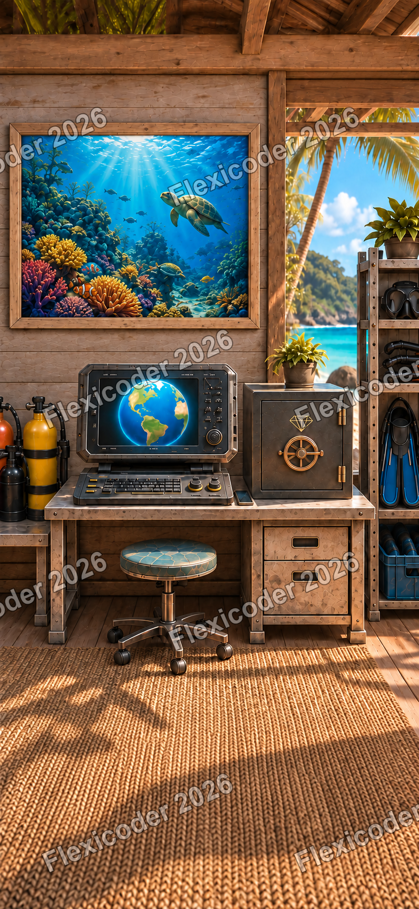
The room now explains itself
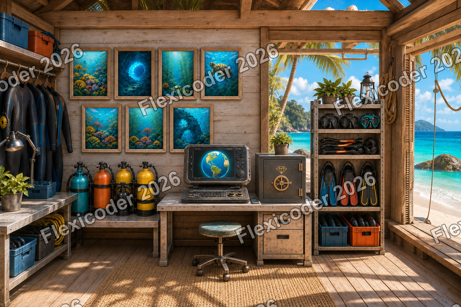
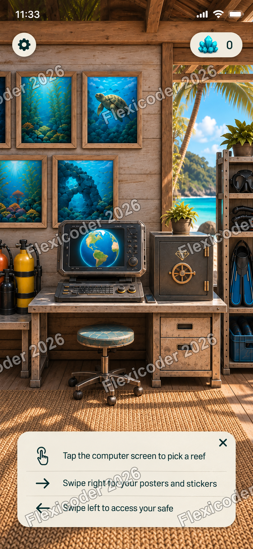
Prompt: Reduce the wall to one poster so the poster, dive computer and safe can all fit in a single view.
Outcome: The three interactive objects now share one composition and can be tapped directly, removing the need for swipe-led navigation instructions.
Designed
A treasure sequence closed the dive
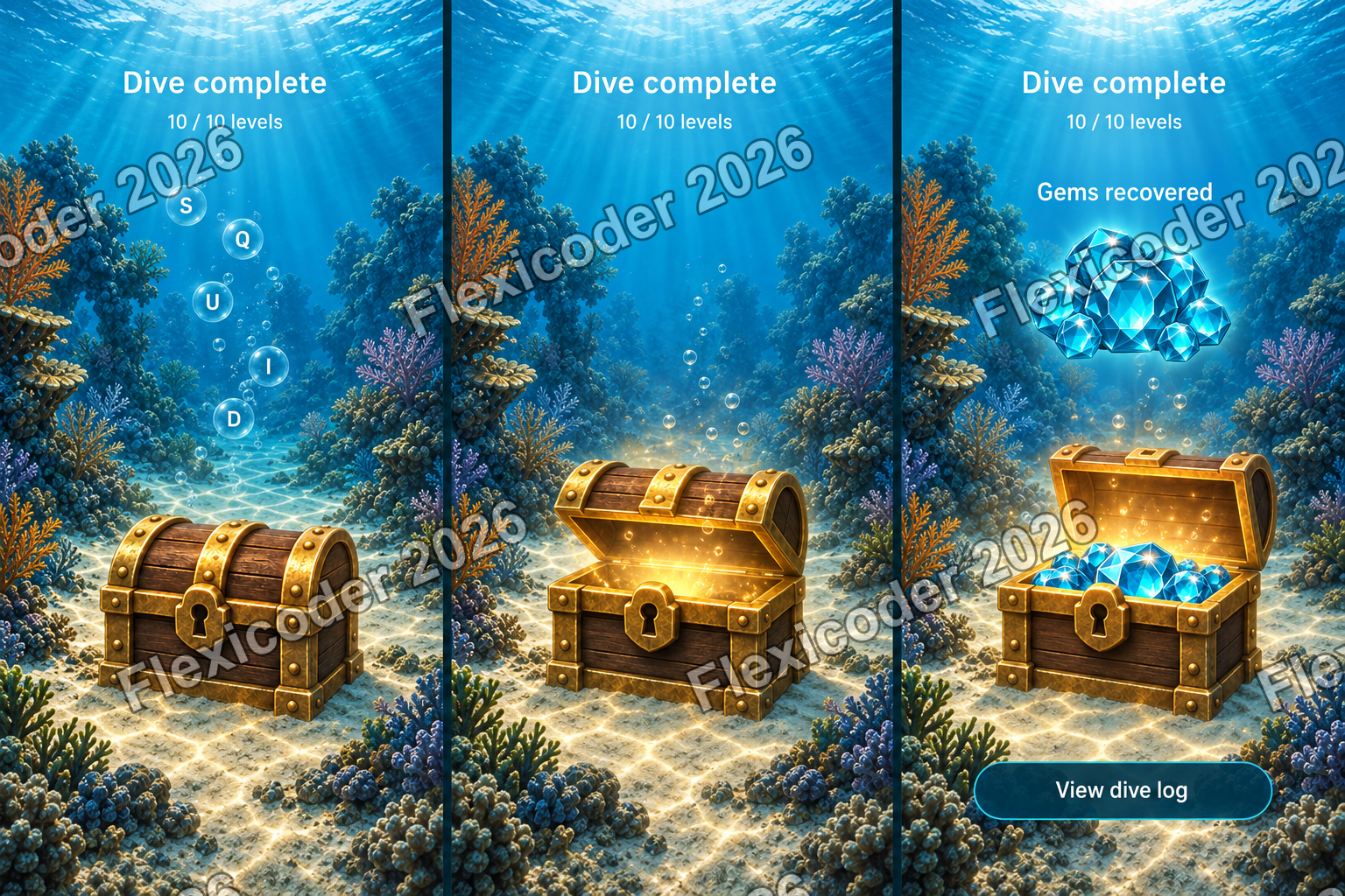
Prompt: Show how the last grid clears, the chest is revealed, the lid opens automatically and the recovered blue gems lead into the dive log.
Outcome: A three-beat storyboard established the pacing, kept the reward amount deliberately unspecified and included a reduced-motion fallback.
Implemented
Gameplay and reward share one reef
Prompt: Carry the chosen underwater direction into the live wordgrid and keep the treasure chest on the same sandy seabed.
Outcome: The grid, selection treatment and chest reveal now occupy one continuous reef environment with white typography and aqua controls.
Polished
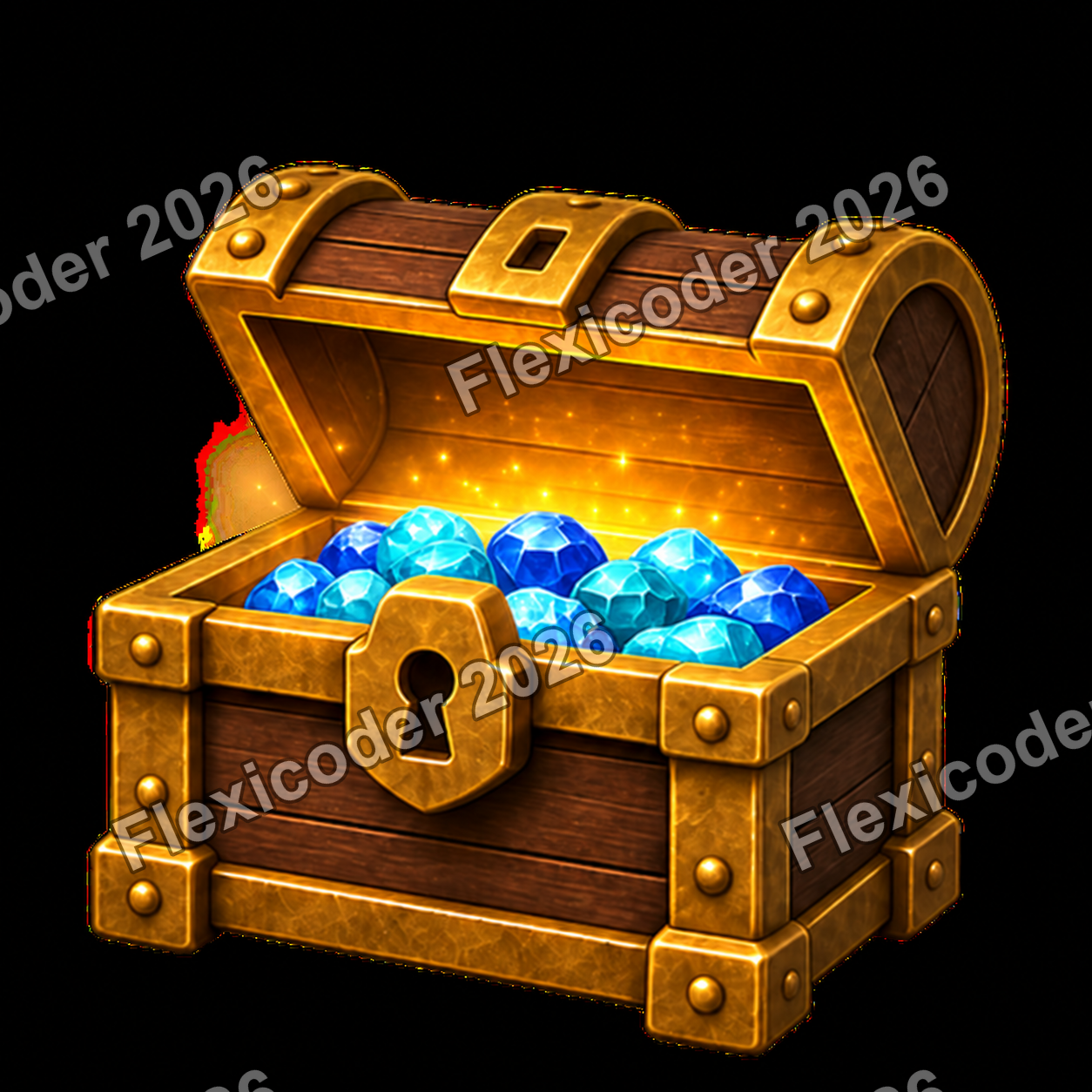
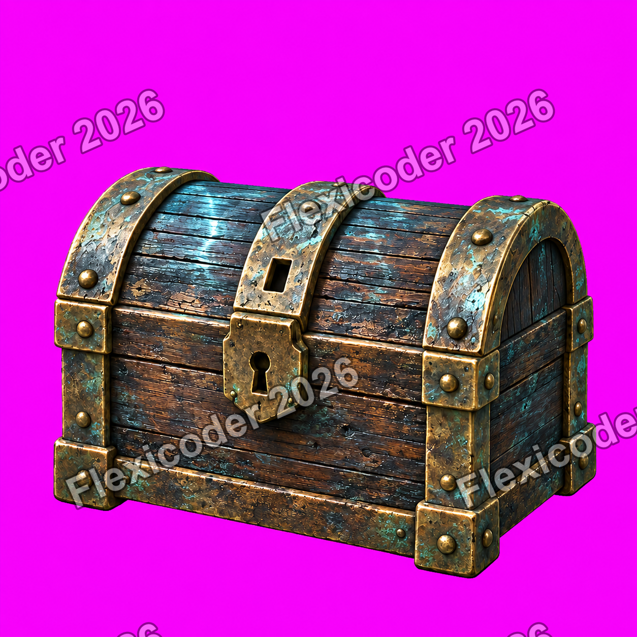
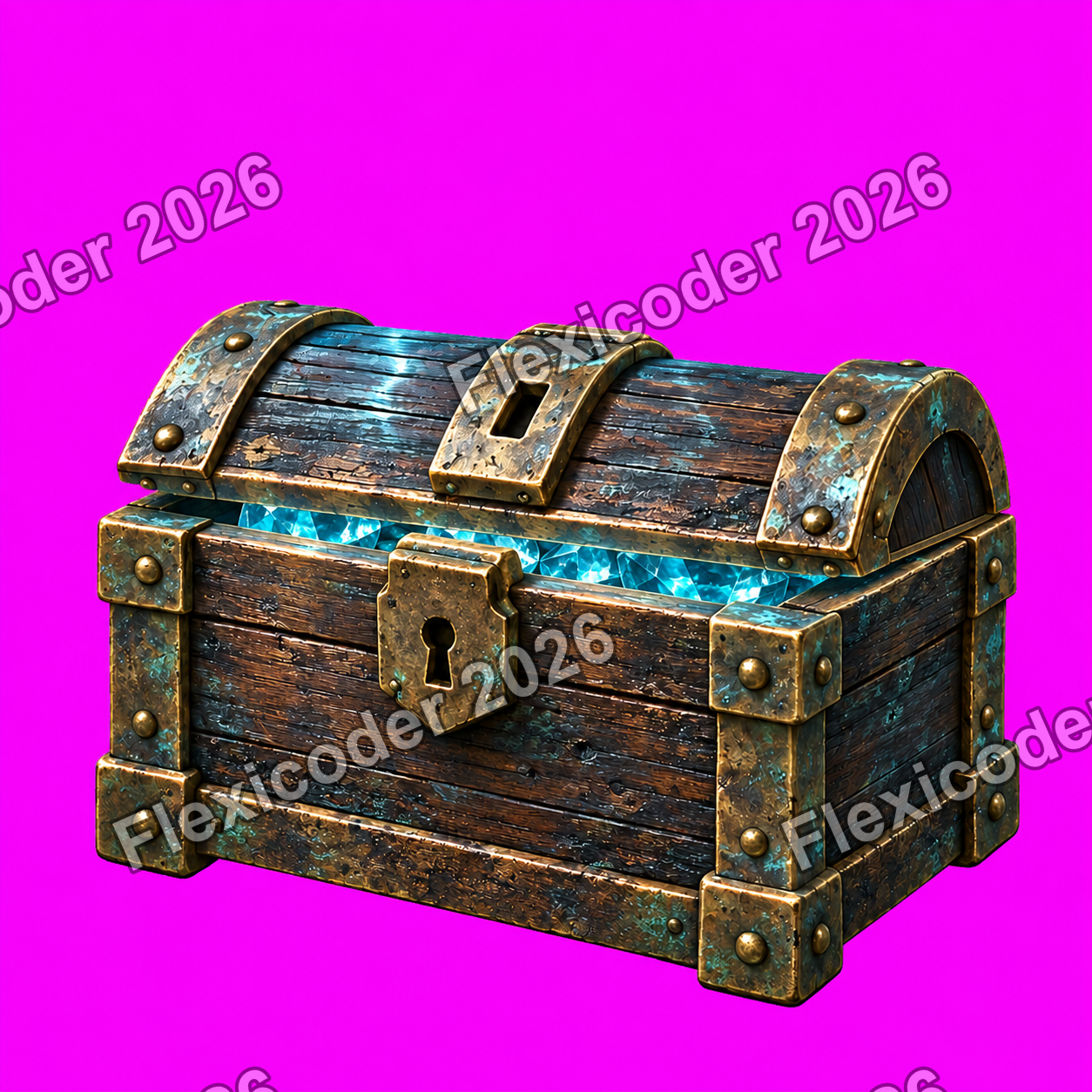
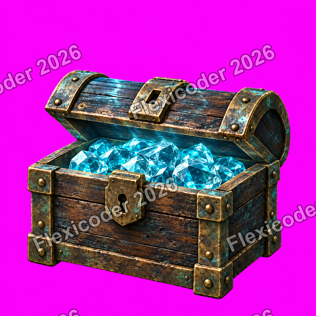
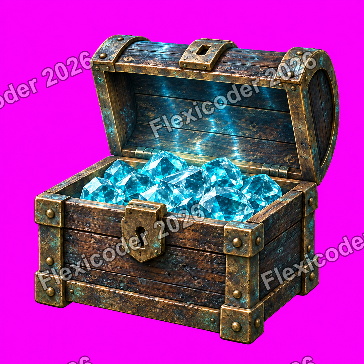
The chest became a stable production sequence
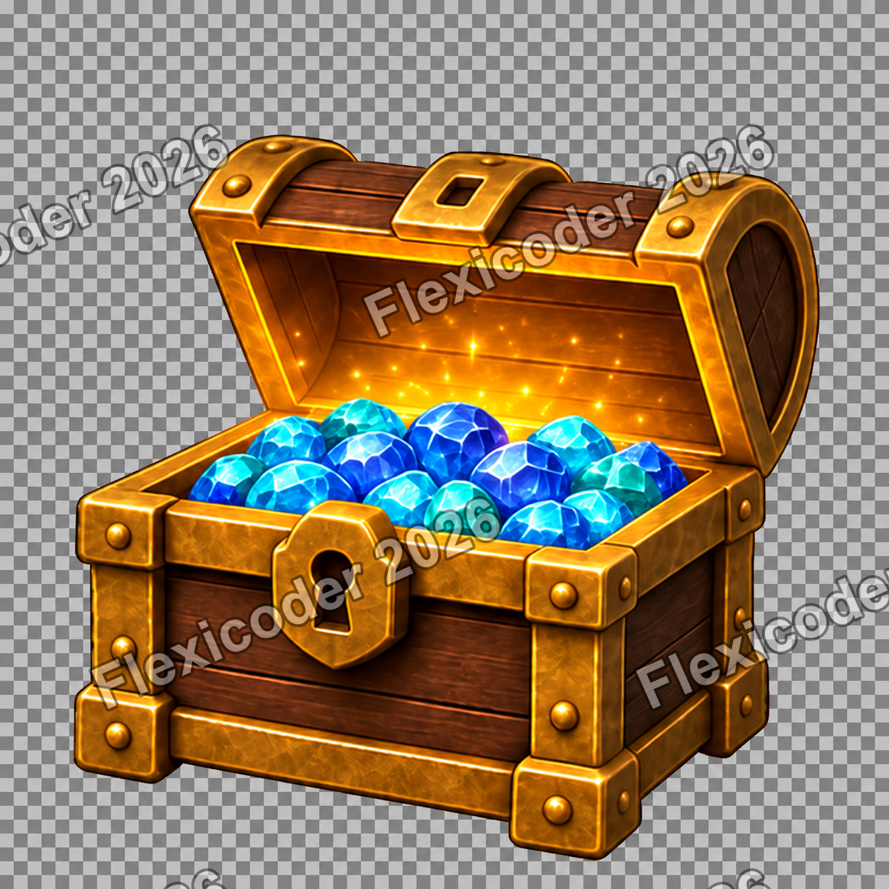
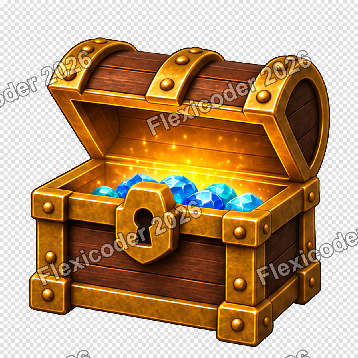
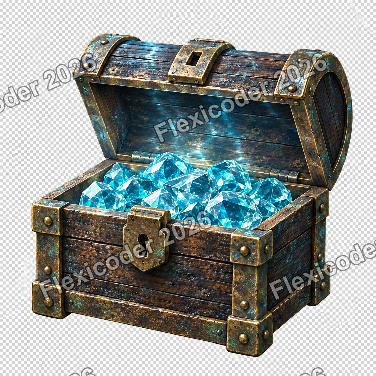
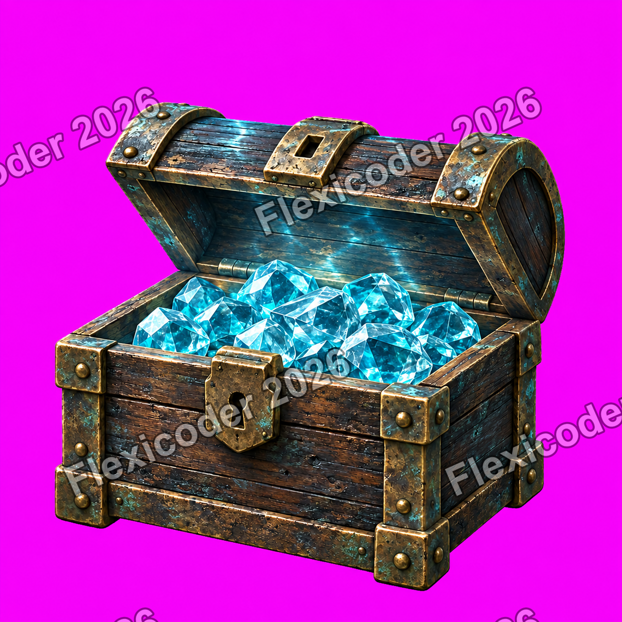
Prompt: Replace the softer cartoon treatment with crisp weathered timber, aged bronze and aqua gems, while keeping every opening frame fixed to the seabed.
Outcome: Six aligned frames were prepared, visually checked in the running app and integrated with the surrounding underwater scene before the completed work was synchronised.
What improved
Improvements made.
Evidence-led changes grouped around the product, implementation, design and working process.
Habitat-appropriate collection scenes
Wildlife is grouped by reef, shallows, shore and open water instead of being forced onto one poster regardless of scale or environment.
Safe sticker previewing
A development-only unlock path makes the full collection testable without purchasing stickers or spending the player’s gem balance.
Consistent expedition styling
Barlow typography, paper-toned information surfaces, aqua accents and clearer hierarchy now connect the room, maps, collections and dive results.
Clearer interaction and navigation
Available dive cards are fully tappable, destinations are named more clearly, contrast is stronger and interactive room objects remain visible.
Complete restricted-dive economy
Air depletion, refill prices, resurfacing rewards and medal timing now behave as one coherent gameplay rule set.
Immersive wordgrid environment
The playfield sits directly over calm blue water with coral held to the edges, protecting readability while making the screen feel submerged.
Single-view equipment room
One poster, the computer and the safe fit together as obvious physical destinations, replacing hidden objects and redundant labels.
Reward reveal continuity
The chest appears after the final grid in the same scene, then opens into the blue-gem reward and the dive-log action.
Higher-fidelity chest animation
Weathered materials, consistent camera framing and six staged lid positions give the reward moment a more grounded, dependable finish.
Broader implementation confidence
Focused logic checks, simulator journeys, accessibility states and both development and production-style builds were exercised across the changes.
Pain points
Friction, constraints and open edges.
Resolved problems are separated from constraints and work that remains open.
Generated transparency was unreliable
Several cutouts arrived with checkerboard or colour-key backgrounds baked into the pixels. Local image preparation was authorised and used to create dependable transparent animation assets.
An accessibility capture looked like the default UI
A large-text verification screenshot was initially easy to mistake for the normal design. The state was clarified and normal-size typography remained the product default.
Live purchases still need service connections
The in-app economy and purchase surfaces are designed, but live transactions still depend on store configuration, entitlement handling and a connected wallet service.
A final device pass remains valuable
Automated and simulator checks are strong, but physical-device timing and a final end-to-end accessibility review remain useful before release.
Outputs & proof
What was delivered and verified.
The work was checked at both feature and presentation levels. Habitat placement, restricted-dive rules, room composition, underwater gameplay and the chest sequence each received focused verification, while the visual concepts were reviewed before being promoted into the app.
Verification record
- The habitat implementation passed 49 focused logic checks, three simulator journeys and both build configurations.
- Restricted-dive timing and refill behaviour passed 45 focused checks, three interface journeys and both build configurations.
- The single-view equipment room passed 16 focused checks and both build configurations.
- The underwater wordgrid and reward integration passed 22 focused checks, five interface journeys and both build configurations.
- The refined chest sequence passed 12 focused checks, two interface journeys and both build configurations.
- The completed integrated work was synchronised successfully with no pending project changes.
Key decisions
Keep posters as tactile room souvenirs, but let them open curated habitat scenes rather than carry every species directly.
Use Clear reef descent as the default wordgrid environment because it offers the best balance of depth, warmth and legibility.
Keep the poster, computer and safe visible together and let the objects themselves provide navigation.
Offer air refills only when the tank expires, and preserve total active time so refills cannot reset medal difficulty.
Reveal the treasure automatically after the final grid and avoid inventing a reward amount before the economy determines it.
Retain the established blue-gem artwork in the product even when exploratory mockups suggest a different icon treatment.
Visual checkpoints
Generated and edited images.
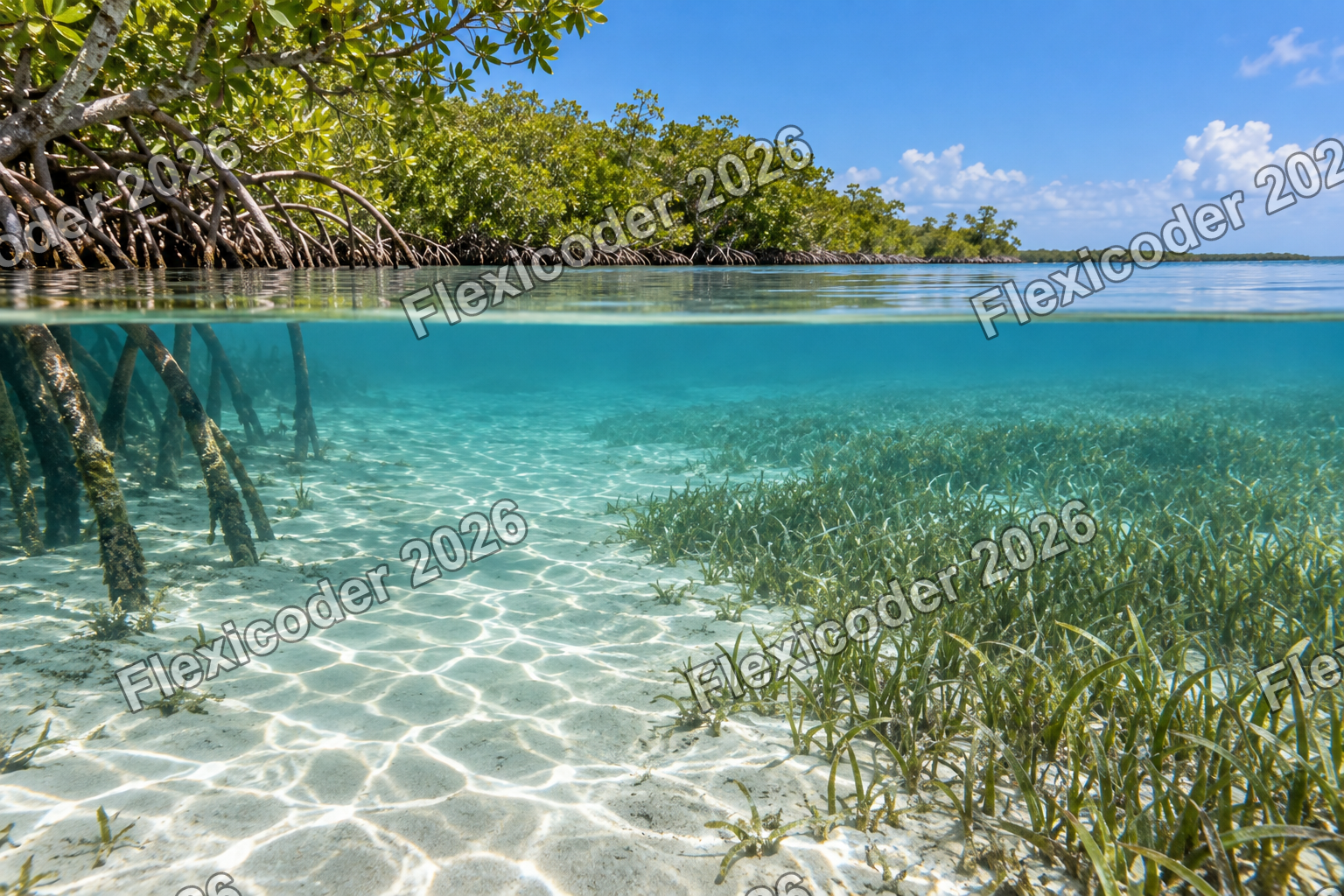
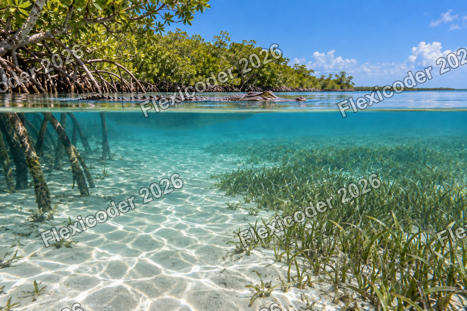
The visual record follows the work from habitat experimentation through room and gameplay concepts to the finished reward sequence. Intermediate transparency failures are retained because they explain why local asset preparation became necessary.
Next moves & open questions
Current position.
The habitat model, interface refresh, restricted-dive loop, underwater gameplay, equipment-room composition and treasure sequence are integrated and synchronised. The strongest next gains are extending the habitat treatment to the remaining reefs, connecting live commerce services and completing final physical-device validation.